Web Design
•
5 Personal Trainer Website Mistakes That Cost You Online Clients
If your trainer site has a contact form instead of a booking link, you're paying for traffic with no way to convert it. Five common website mistakes and the fix for each.

I've watched trainers ask "why aren't I getting clients off Instagram?" for years. The honest answer is rarely the content. It's the handoff. Your site is the bottleneck. Not because it looks bad. Because it doesn't do the one job it's there to do. Turn a curious visitor into a booked session.
I've been looking at trainer sites for the last few weeks. Most of them have at least three of the mistakes below. The good news. Each one takes under an hour to fix, and the lift compounds. A site that fixes all five typically goes from "I don't really get inbound" to "I have a steady weekly trickle" within a couple of months of the changes going live.
Summary
A "Contact me" form is a conversion killer. Use a calendar link with a specific session offer.
Your site needs pricing. Even if it's a starting price. "Get in touch for pricing" is a no.
Trainer photos beat stock photos. Invest in a high-quality photography shoot. Use the photos for years.
Generic credentials (NASM, ACE) are background noise. Lead with a specific outcome.
"Online training" without a sample workout, sample week, or sample call is asking for trust you haven't earned yet.
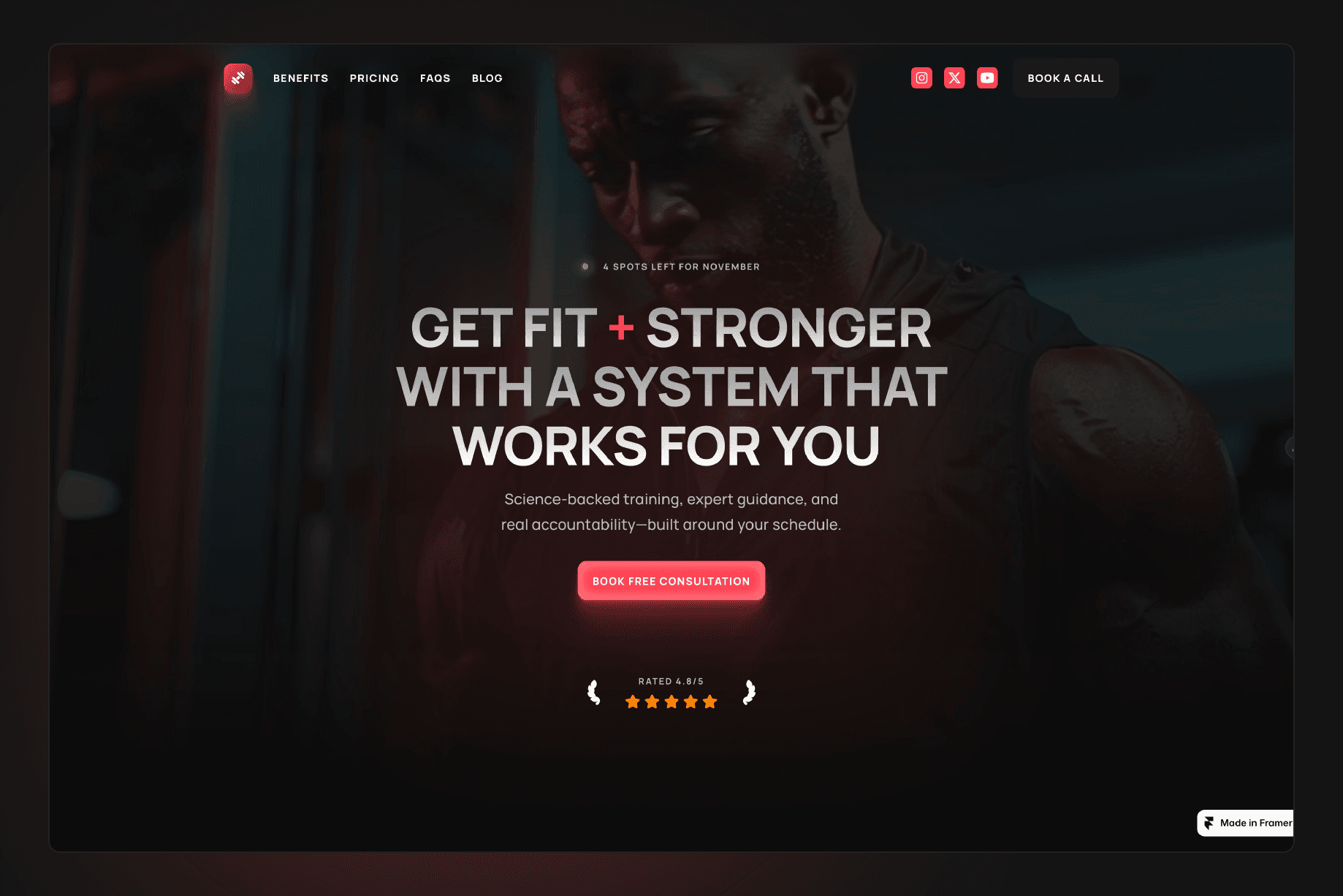
Mistake 1: A "Contact me" form instead of a booking link
I'll keep saying this until trainers stop building it. The "Contact me" form on a trainer site is where leads go to die. The visitor fills it out. You reply 6 hours later. They reply the next day. You reply that evening. By the time you've found a slot, they've signed up with someone faster.
Replace the form with a booking link. Calendly, Cal.com, or your gym's native scheduler. Label it specifically. Not "Book a call" but "Book a free 15 minute consult" or "Book a complimentary intro session." The specificity is doing work.
If the visitor's not ready to book yet, they'll bounce. That's fine. Cold visitors aren't your customer. Visitors who are ready to book want zero friction. A site like Reformr is structured around exactly this. Booking link in the nav, in the hero, mid page, in the footer. Multiple chances. One click each.
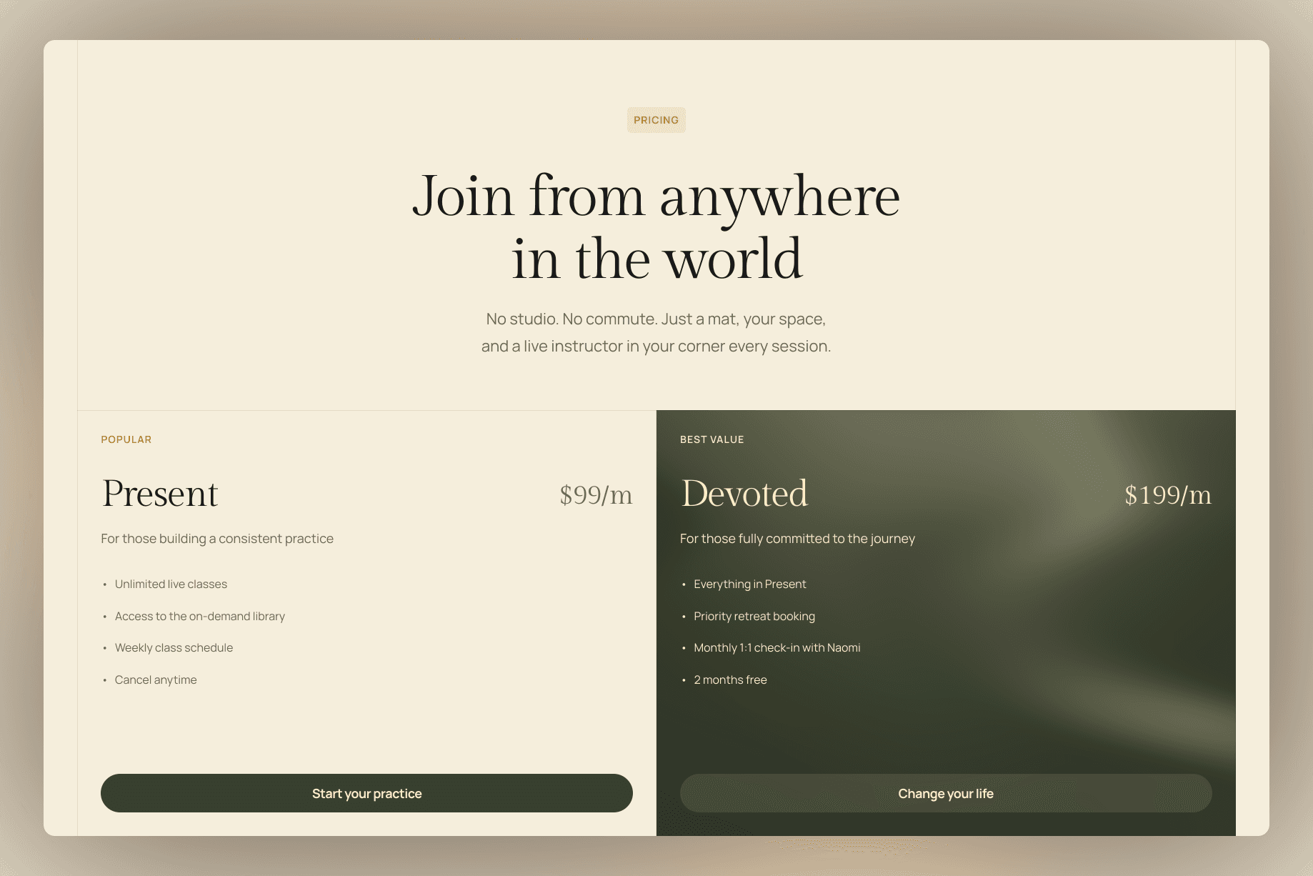
Mistake 2: Hidden pricing (or no pricing at all)
"Get in touch for pricing." Three words that lose more trainer leads than anything else.
The argument trainers give for hiding pricing is that it lets them tailor the offer. The reality is that most visitors interpret hidden pricing as "this is going to be expensive and they don't want me to leave the page before they've convinced me." So they leave the page.
You don't have to publish your full menu. You need a starting price. "Sessions start at £75" or "12 week programmes from £600" anchors expectations and qualifies leads in the same line. Visitors who can't afford that bounce. The ones who can keep reading.
If you genuinely have a tiered model (online vs in person, packages vs single sessions), build a simple pricing block. Three columns. Headline price. Two or three bullets per tier. Done in 20 minutes.
A great example is Zenna. Two pricing tiers with a clear distinction between the benefits and value offered.
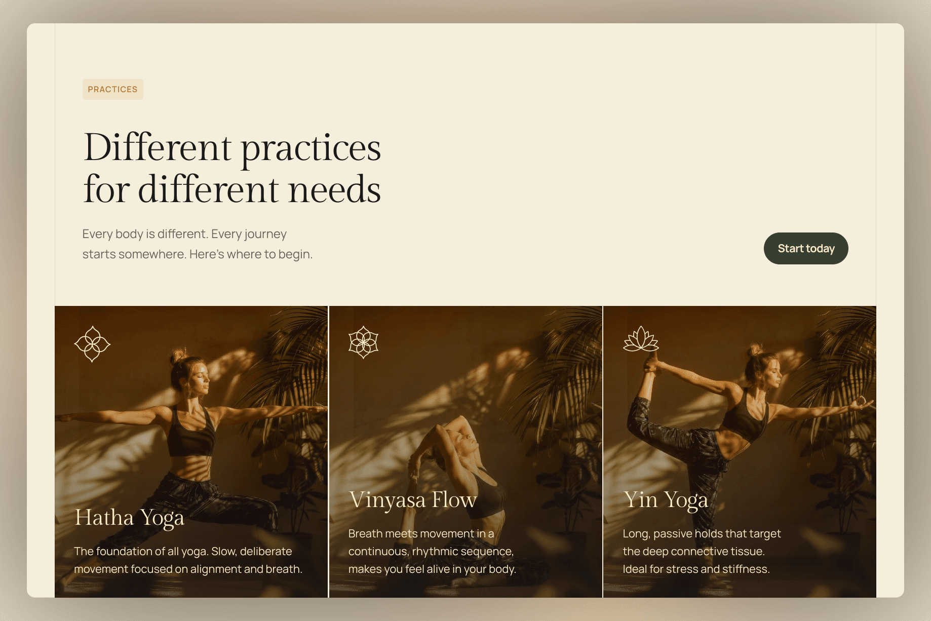
Mistake 3: Stock photos of someone else's gym
Stock photos are the fastest way to look like every other trainer on Google. Same model. Same kettlebell. Same lighting. Same clean white floor. Visitors don't trust photos that don't include you, and they don't trust photos that look like every other trainer's site.
Invest in a 90 minute photoshoot. Get 20 to 30 usable images. You coaching a real client (with permission), you mid rep on a deadlift, your actual gym space, a close up of your hands chalking up. These photos are a multi year asset. The cost per use is trivial.
If you genuinely cannot afford a photoshoot this month, screenshot stills from your Instagram reels. They're already authentically you, in your space. Better than stock 100% of the time.
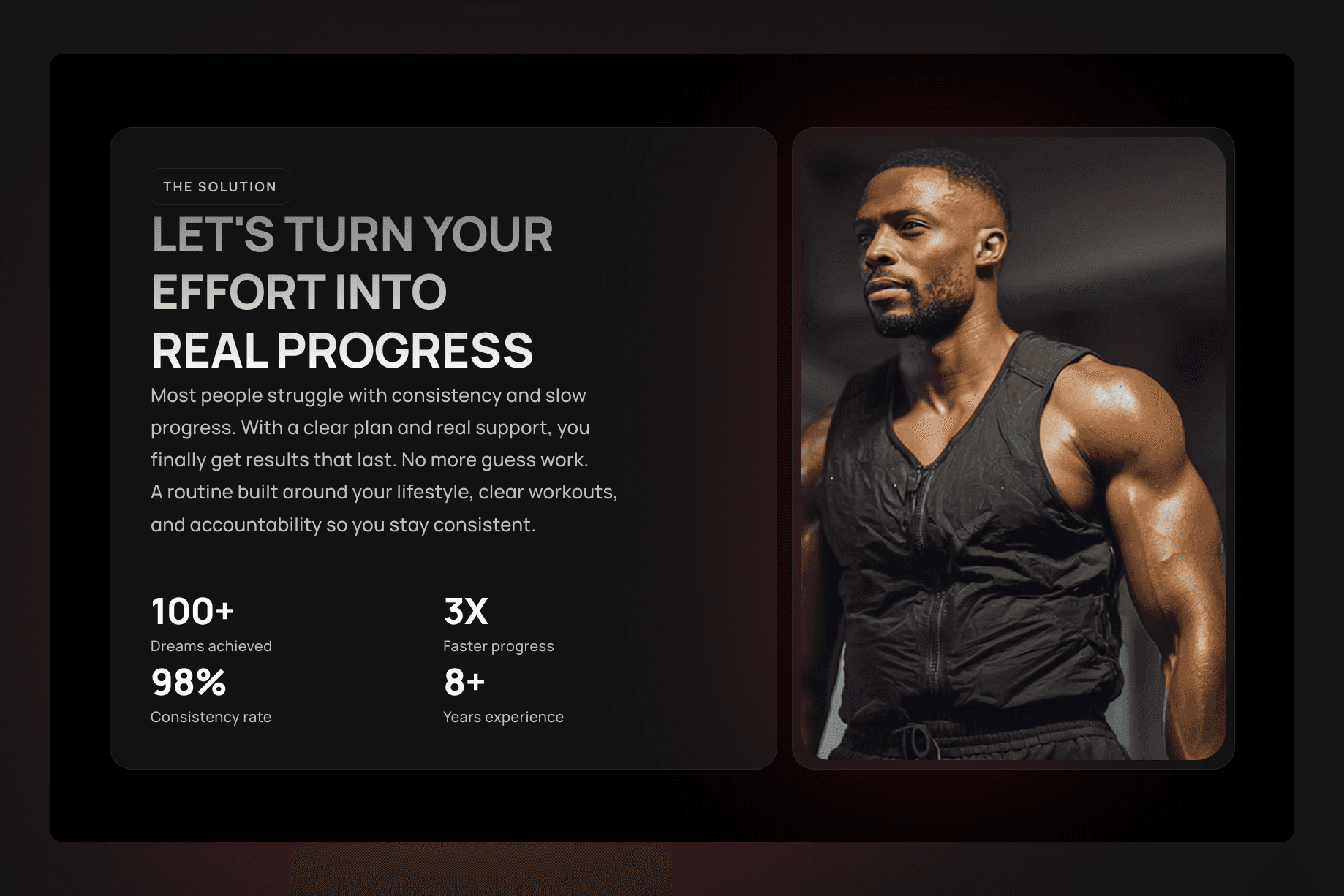
Mistake 4: A bio that lists certifications instead of outcomes
Most trainer about pages read like a CV. NASM certified. Functional Movement Screen Level 2. Precision Nutrition. Pre and postnatal specialist. Eight years of experience.
These are useful, but they're table stakes. Every trainer the visitor is comparing you to has a wall of acronyms. None of those acronyms tell the visitor whether you're going to help them.
Lead with the outcome you produce. "I help busy professionals get back into the strongest shape of their lives in 12 weeks. Without giving up dinners, weddings, or weekends." Then the credentials. The order matters. The outcome is what gets read. The credentials are what closes the trust loop after the outcome has done its job.
Mistake 5: "Online training" with nothing to look at
If you offer online training but your site doesn't show a sample workout, a sample week, a sample check in, or a sample call, you're asking visitors to pay for something they've never seen. This is the single biggest reason "online" trainers struggle to convert their site traffic.
Build a free resource that's a tiny version of what you sell. A 7 day starter programme PDF. A 90 second video of a sample form check. A screenshot of what a typical client's training app looks like. Anything that lets the visitor experience the format before they commit.
This also gives you a useful email capture. Visitors who download the freebie are warm leads you can follow up with. A coaching template like Partnr has slots specifically designed for this kind of resource led lead gen, but the principle works on any site.
What to fix this week
Pick the easiest one. Replace the contact form with a booking link. That's 30 minutes of work and you'll see the lift inside two weeks. Then add a starting price next week. Then book the photoshoot the week after. The full list takes about a month to work through if you do one a week.
If you're building a new trainer site from scratch, or your current one was built before 2023, the Reformr template is set up around the structure these fixes assume. Booking link in the nav, pricing tier block, photo led hero, outcome led bio, freebie capture in the footer. You don't have to use it. You do have to make sure your site has the same bones.
Not sure if your business needs an in person trainer site or a coaching online program site? The 60 second template quiz will narrow it down based on how you train, who you train, and what you charge.
The site is the easy part. Showing up to coach is the hard part. Don't let the easy part be the reason your hard work doesn't pay.
Read next:
How to Price a Personal Trainer Online Programme (Without Underselling Yourself)
5 Things on a Trainer Instagram Bio That Lose You Clients
Why "Free Consult" Beats "Free Session". The Lead Quality Difference