Web Design
•
5 Local Service Business Websites That Stopped Looking Cheap
Five common patterns that take a local business site from "built in 2017" to "books inquiries weekly". The exact changes that move the needle, without hiring an agency.

A site that "looks cheap" doesn't mean it's ugly. Most of the time, it means the site looks like it was built five years ago, on a different platform, by a friend's nephew, in a hurry. Visitors don't articulate what's wrong. They just leave. And they leave faster than you think. Average time on a poorly aged local business homepage is under 8 seconds.
If you're running a local business that's been doing okay not great for a few years and your site hasn't been touched recently, the gap between where you are and where you'd be is smaller than you'd guess. The five patterns below are the ones I see most often. Each one is fixable in an afternoon. None of them require a full redesign.
Summary
Replacing every photo with one shot from a 90 minute professional shoot is the fastest single lift.
Three fonts to one font, three colours to two colours. Visual coherence does heavy lifting.
A "Get a quote" form that asks 2 questions beats one that asks 12. Every time.
Mobile first isn't optional. Most local business traffic is from a phone.
One clear, prominent call to action above the fold beats a navigation menu of options.
1. The bakery problem: Replacing every photo, fixing one CTA
If you sell something visual (food, hair, flowers, craft, anything where the product is the proof) the photos are the website. Generic photography from your phone in 2024 light is not a substitute. Stock images of pastries are not a substitute. A fresh shoot is the highest ROI single thing you can do.
Spend a half day on a professional shoot. Replace every photo on the homepage. Move your primary CTA ("Order online", "Book a table", whatever it is) to the top right of the nav and above the fold. Don't bury it in the footer.
2. The dog groomer problem: Collapsing 3 pages into 1
For most local service businesses with under five services, a single page site works better than a multi page site. The visitor stays in one mental flow. You don't lose them between pages.
Structure it like this. Hero with one great photo. Services with prices inline. A 3 step "How it works" section. Testimonials. Booking calendar embedded directly on the page. Five sections, one URL, one decision.
If your booking lives on a separate domain (your scheduler app, for instance), bring it back. Embed the calendar. Cohesion matters more than you think.
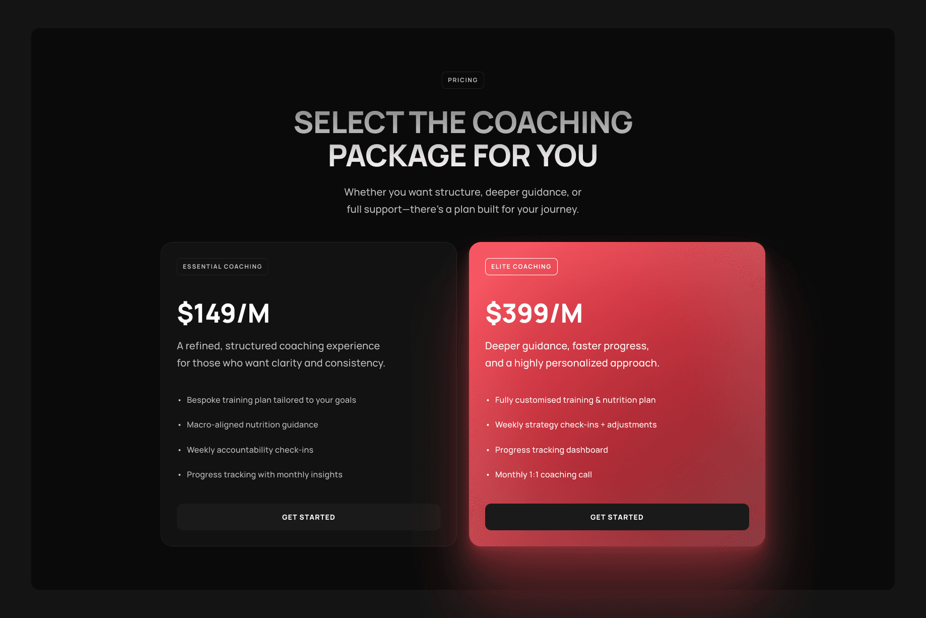
3. The personal trainer problem: Pricing in the open
Hidden pricing is the single biggest conversion killer in local service businesses. Visitors translate "Get in touch for pricing" as "this is expensive and they don't want me to bounce before they've sold me." So they bounce.
You don't have to publish your full price list. You need a starting price. "Sessions from £80" or "Programmes from £900" anchors expectations and qualifies leads in the same line. Pair it with a booking link labelled "Book your free intro" and you've replaced two of the most common conversion bottlenecks at once.
A template like Reformr bakes in this exact structure. Pricing visible, photo led hero, booking link as the primary CTA. You can retrofit any of these patterns into an existing site in an afternoon.
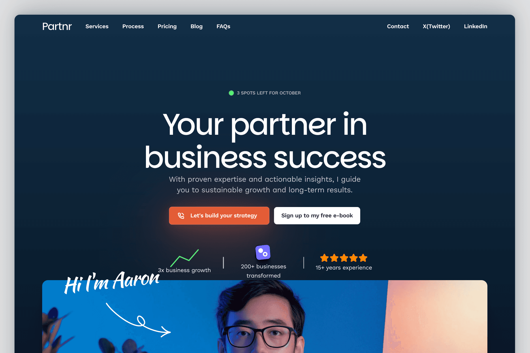
4. The accountant problem: Specialise on the homepage
The accountancy firm version of "looking cheap" usually isn't visual. It's positioning. Generic homepage copy ("Accounting services for businesses in [city]") loses to specific homepage copy ("Accounting for creative freelancers and small agencies in [city]"). Even if you serve a broader audience.
The reason is search intent. Someone Googling "accountant for freelancers [city]" is far more likely to convert than someone Googling "accountant [city]." Specialise on the homepage and you become the obvious answer to a more specific question.
Specialising doesn't mean turning down other clients. It means making the right ones feel "this is for me" the moment they land. A coaching consulting layout like Partnr is built around this same kind of niche led positioning.
Three different fonts. Four brand colours, including a particularly aggressive teal. Every section with its own background colour and its own button style. This is what most local business sites look like after five years of "let me just add this section quickly."
The fix is to delete, not add. Single typeface (one for headings, the same family or a neutral pairing for body). Two colours, max (cream plus a warm dark grey is a safe default). One button style across the whole site. One CTA above the fold.
Visual coherence reads as professionalism. You don't need a new brand identity. You need to actually use the brand identity you already have, consistently. Visitors will tell you it "looks more like the business" without being able to say why.
What this means for your site
If you read those five and recognised your own site in two or three of them, that's normal. Most local service sites have the same handful of issues, because they were all built around the same template advice five years ago.
Pick one to fix this week. My recommendation: Photos first, because the lift is biggest and the cost is fixed (one shoot, three years of value). Then the pricing block. Then the CTA cleanup. The whole list is a month of evenings.
If your site is genuinely past the point where retrofitting makes sense (built on an old platform, slow on mobile, can't be edited without paying someone), starting fresh on a purpose built template is faster than dragging the old one into 2026. The right template gets you 80% of the way. Your specific business gives you the 20% that makes it yours.
Not sure which template fits your business? Take the 60 second quiz. Answer a few questions about what you sell, who buys, and how you want to grow, and it'll narrow your shortlist.
Your business doesn't need a great website. It needs one that does the boring things (clear photos, visible pricing, easy booking) well, every day, on every phone.
Read next:
Local Business SEO: The 5 Pages Google Cares About in 2026
Why Your Google Business Profile Matters More Than Your Homepage
7 Booking Flow Mistakes That Cost Local Businesses Customers Every Day